Katie Zazenski
Katie Zazenski: Hi, Kuba. It’s great to see you, thanks for sitting with me today! Let’s get right into it: you have played a pretty significant role in the development of MOST by creating our logo. Can you tell us how you developed this?
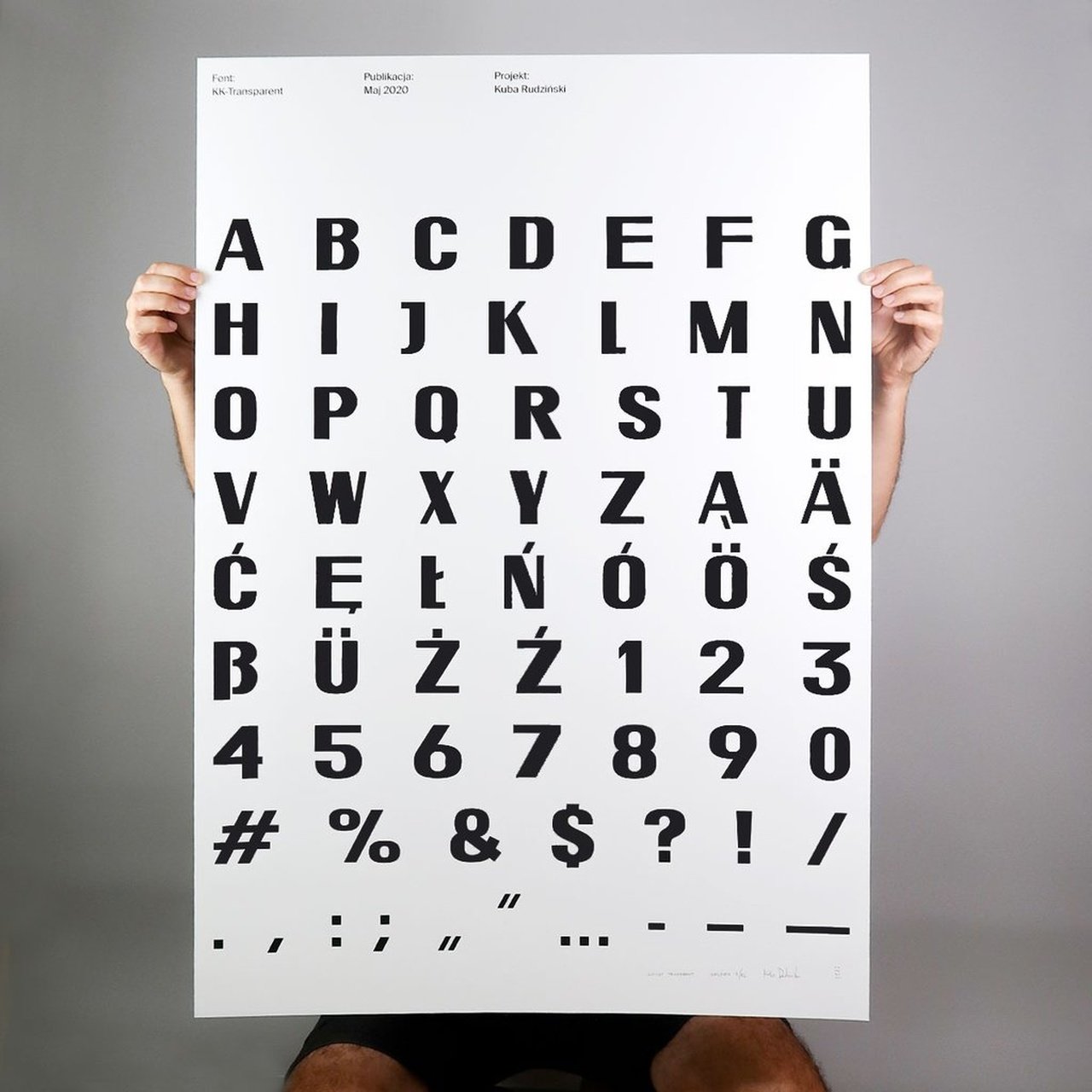
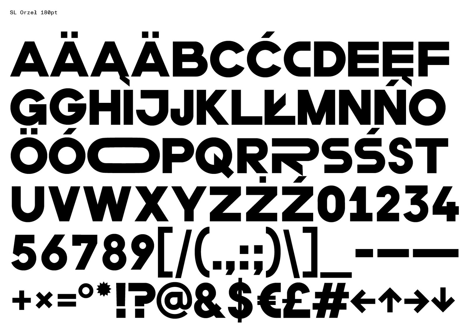
Kuba Rudziński: Absolutely! Yeah. So it was a great pleasure and I was super happy to be invited. It was really, really fun working on it and it’s a dear project for me because I used my typeface – of my own design – and it’s also the first typeface I ever designed! So I have this soft spot in my heart for the projects which use the SL Transparent typeface.
KZ: When did you design it?
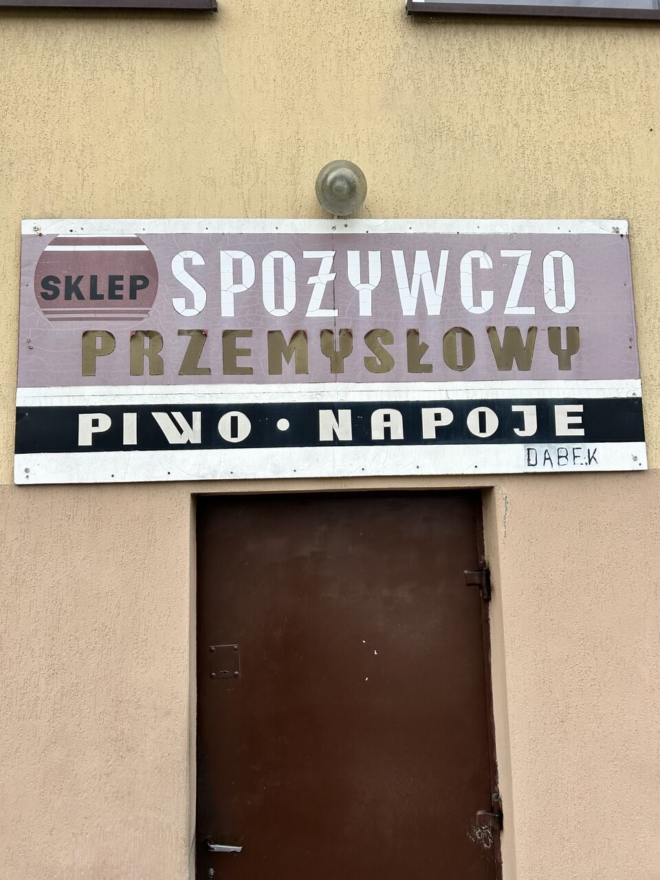
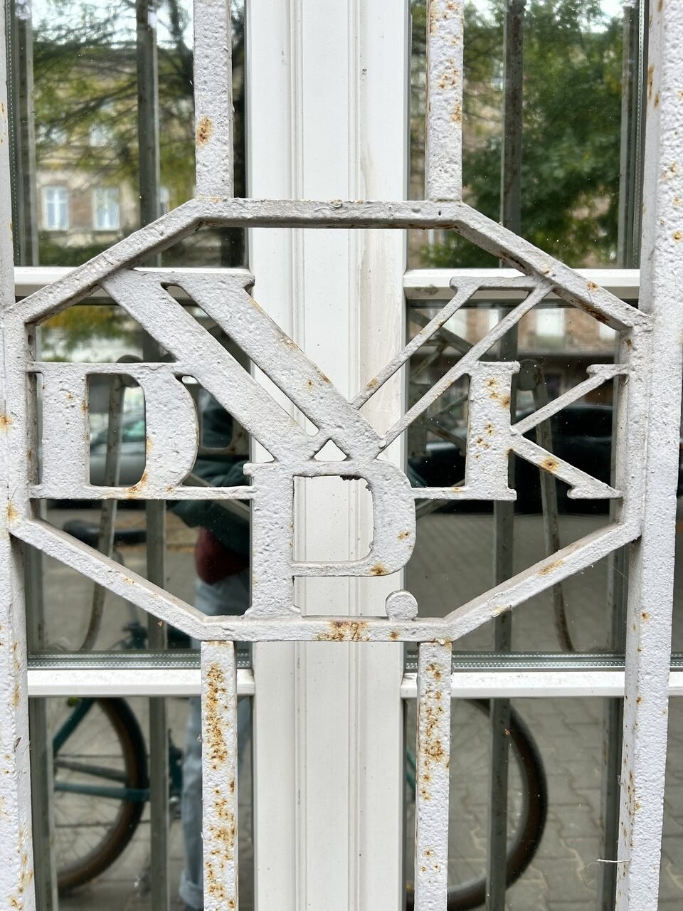
KR: Good question. Around seven years ago. I was really fascinated by typography, and I started to do these “type hunts.” You know, document typefaces or scripts or lettering on streets, in public space, etc. And the one which really drew my attention was this kind of enamel board in Zakopane. It was actually the Związek Kombatantów Polskich. And it was done in this way that it really looked almost as a machine would do it. So it was very kind of mechanical and geometric at the same time…
KZ: But it was hand-painted?
KR: Exactly. And within the board there were maybe five or six lines of text, and I realized that there is a whole kind of universe, or like system, going on in there. There was a normal width, there was a condensed width, then every letter, when it was repeated, it kind of differed from the previous one a little bit. There was a little bit of a different approach to each of the letters. So it had both of those qualities, the mechanical one and the humanistic one – the hand/DIY one. I love that blend. Many of the boards like that and signage are now being removed or do not exist anymore. I don’t think they were really lettering artists or graphic designers, but more like maybe craftsmen that were doing it.
KZ: Do you think that makes a difference, if they are considered craftspeople or artists?
KR: I think so. I bought this manual for hand painted signage; it’s a Polish manual first published in 1953. And there are these instructions for how to make letters, and it’s quite interesting, like, is there a “proper” way to make a letter? I mean, a graphic designer would probably approach it differently. But, you know, they were like, okay, we’ve got a task, we need a sign for the Związek Kombatantów, right?
KZ: So this manual was for only ministry-related offices – could only certain people use it or was it a public handbook for anyone to use?
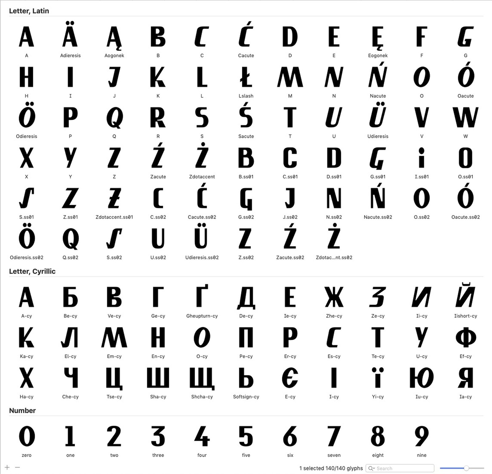
KR: Yeah, it was a public handbook and there are a couple of scripts to choose from. There are more like, hand-written scripts, like something for a flower shop or a bakery, and then there were these more blocky ones. So yeah, it’s quite interesting because I still continue working on the SL Transparent typeface design. I’m developing it as a full-scale typeface including weights and widths because [by nature] it is a bold font and I want to create a complete character set with all the diacritics from different countries, basically covering almost the complete set of Latin characters. At the moment it covers more than 160 languages. But what I think is important in terms of MOST was that you guys led me into this multilingual direction.
KZ: Did you have all of those different diacritical marks before you made the MOST logo?
KR: Not at all! It was kind of a first. I mean, I had an idea to develop this, but it was this project which pushed me to actually go ahead and do it. We had this idea to make an animated logo with different diacritics…
KZ: …To represent the different readership and geography of MOST.
KR: Absolutely. So now we are continuing to develop it. I have made it available to the public and it is free to download from my website – it’s an initial version of the typeface including capital letters only. Working on MOST was when I started to think about the lower case. There is an interesting story about lowercase that not many people know: upper and lower case typefaces are completely separate, distinctive systems that have different formal origins. The blueprint for Latin capital lettering came from the Column of Trajan in Rome. The letters were carved in stone and are based on geometrical rules. I’m fascinated by these rules in the letters and in developing lettering. So [on the column] letters are basically composed of basic geometrical shapes – a circle, a square, and a triangle: the triangle being an A, the circle being an O, but for example, the S is composed of two circles, one on top of the other. It’s half narrower than an O, so basically the characters differ in width substantially. And with the E, I believe this is two squares, one on top of each other, but then N is one square. So an E would be narrower than an N on the column. This is fascinating to me and I would like to pursue it in my practice further, this concept when the characters substantially differ in width, they create these interesting rhythms within the text. And it looks beautiful on a page if the characters are balanced, in terms of white spaces within them and stroke widths, but differ in width. So that’s where upper-case lettering has its origin. The lower case was introduced around 800 years later, during the Carolingian dynasty in France, where the written hand script was added, to accompany the upper case. And that’s when these two systems became collaged together – carvings in stone and handwriting with pen and ink.
When you start proper type design, you learn how difficult it is to combine these forms together. You never think of it when you look at text, but actually there are quite different sets of formal rules. So since then I have been looking for the right reference for the lowercase Transparent. And I found it almost impossible to find the right historical reference for this, you know they basically don’t exist or it’s super hard to find. I’m now looking through old book covers.
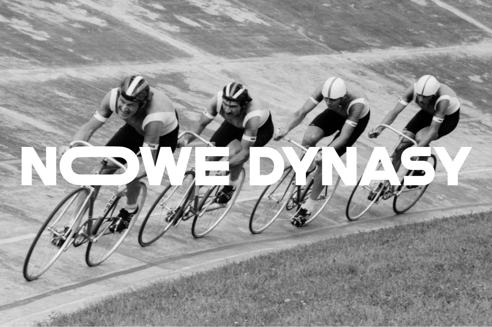
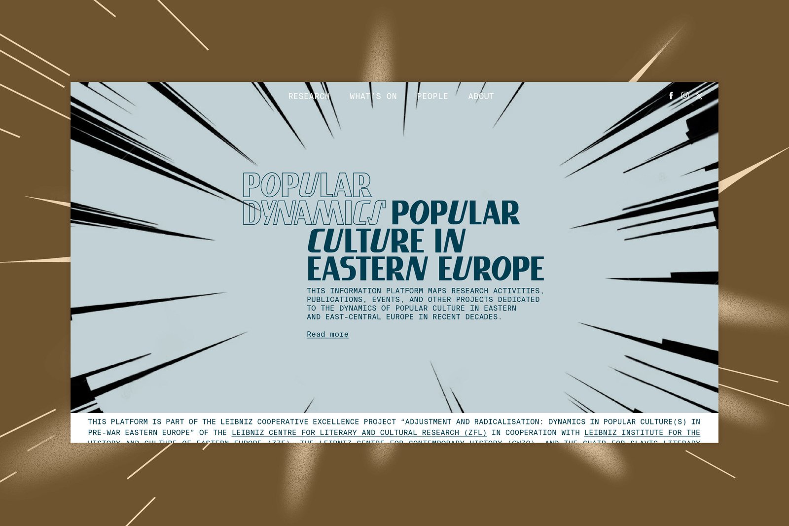
Studio Lekko, Most animation using modified SL Transparent typeface, 2023
KZ: Are you looking within Poland for this – the same region where you found the original?
KR: Absolutely. It needs to be, if not Poland, this geographic region. You know, it’s funny, because I’ve worked with it for so long, but I’m not able to exactly say what is the character of this Eastern European, this Polish flavor. But it is in the shapes. I’m working together with a Swiss-Portuguese type designer on developing the lowercase typeface; we have been working regularly now for half a year – looking, shaping, revising intensively. We had an interesting moment where we were like, okay, we’re finished! We’ve got the lowercase, we’ve got the uppercase in the bold variant, now let’s develop the light. Because that’s how modern type design works – you create the polar versions to have the fattest and the thinnest font variants and then you interpolate the other variants, like for example the “regular” or the “medium” variants. The interesting thing was that when we created this light version, it completely didn’t work! We had done all this work and now we need to go back and rethink the lowercase – alter, sand, polish, and chisel it, bearing in mind what will happen with the light and other remaining variants. And again, I’m looking through my archives to find the right reference for the lowercase.
KZ: I think that’s also why your work resonated so much with us and why we wanted to work with you – without really knowing that we somehow intuited that sensibility from your work, which I think is quite related to our work at MOST.
KR: Many of the clients or people who have asked me to use the typeface or who have commissioned me came for this …flavor, this locality, you know? These geographically informed shapes. And it’s fascinating because when you really analyze it, where is it? What is it? Is it a curve [in the lettering] or a junction of strokes that gives it this characteristic feeling. It’s fascinating.
KZ: How did you learn this process of type design?
KR: The inspiration for how to start the type design process came from a great designer also involved in type – Benjamin Critton (USA) – during his lecture Portrét neúčinnosti (Portrait of inefficiency) at the Biennial of Graphic Design Brno in 2018. He was talking about a reference set or a reference plate – I don’t exactly remember his exact term, but the idea behind it was to find a set of letters – ones that move a designer off course :), but also shapes which most probably do not exist in a form of a digital typeface and develop a whole letter set based on this couple of characters. I must say that really spoke to me and since then this became my methodology.
KZ: What are some of the other projects that you’ve used the typeface [SL Transparent] for?
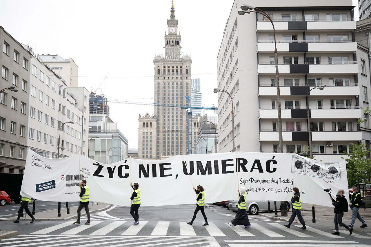
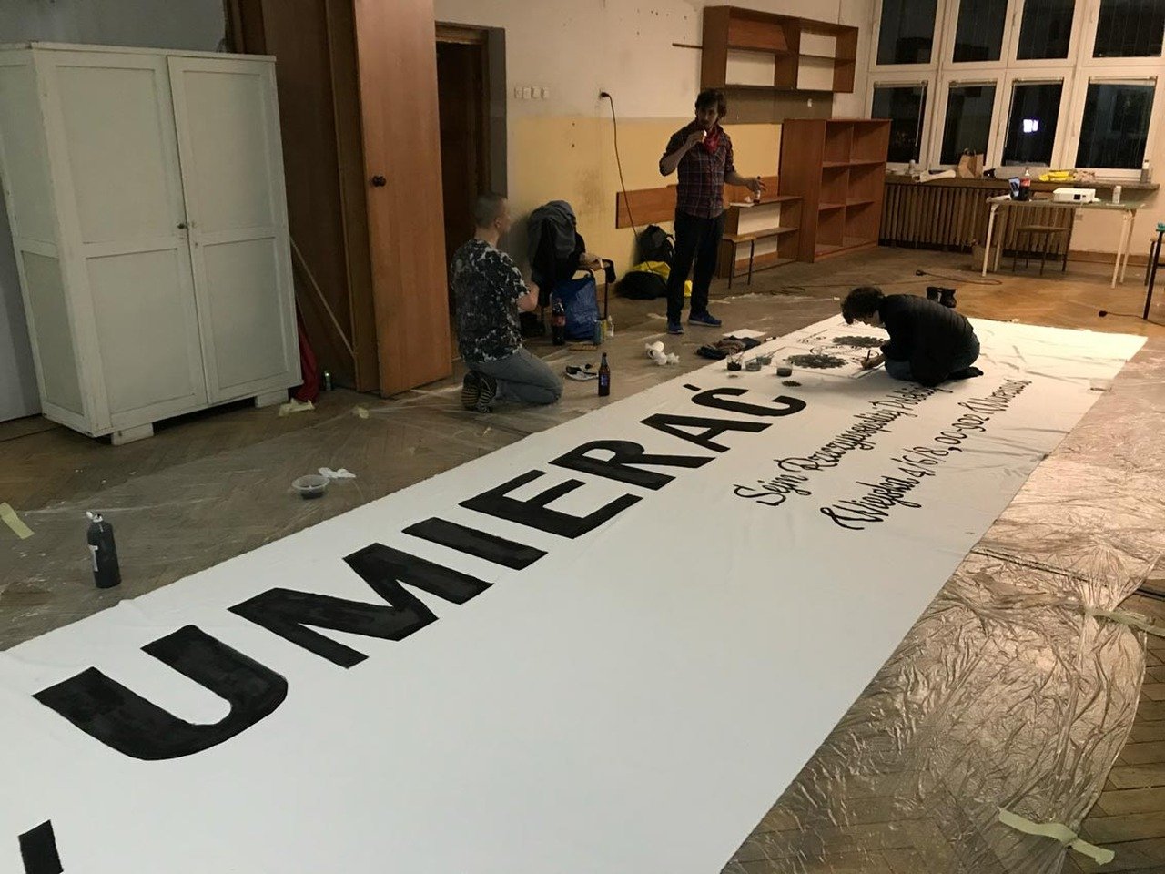
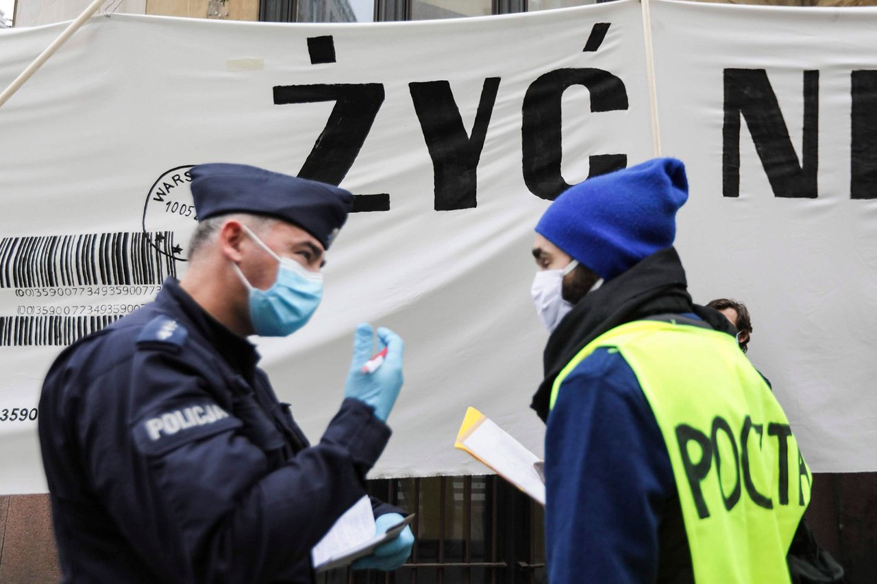
KR: So the first ever use of the typeface was an activist action which happened during the pandemic. I was invited by my partner, Karolina [Grzywnowicz], and we were protesting against the presidential election [in Poland] being organised by post ballot during the pandemic. This could have created a lot of space for improper handling or an untruthful result of the vote. How do you perform an election when you can’t leave the house, you know? And especially in that case, how do you make sure an election like this is lawfully performed? At that moment we decided to go to the street, and the idea was to reenact [Tadeusz] Kantor’s action The Letter from 1967. He made this subtle protest because it was communist times, so you couldn’t openly protest. There were seven postmen who were carrying a 14-meter banner in the form of an envelope, which was addressed to Foksal Gallery. They were carrying the letter from the main post office [in Warsaw] to Foksal [Gallery]. So we decided that we also will become post workers; we’ll keep a safe distance between each of us, two metres of course. Our letter said żyć nie, umierać, which means “to live not, to die” which is a play on a Polish idiom that would normally say żyć, nie umierać (to live, not to die), so normally it would be something to say in a happy, excited state. We were suggesting that this [election] could cause harm to people. And that was the first moment I used my letters from the SL Transparent typeface. I decided that this was a perfect usage of this typeface; it’s easy to paint, it’s legible from a distance, it’s bold, it’s punchy, and can be really applied in this political way – it fit the purpose.
KZ: Who was the we in this action?
KR: It was very organic and dynamic. We created an ad hoc collective made up of Marta Czyż, Marianna Dobkowska, Magda Dragowska, Michał Frydrych, Karolina Grzywnowicz, Yulia Krivich, Julia Minasiewicz, Jan Możdżyński, me, Weronika Zalewska, and Paweł Żukowski. The collective was actually bigger than only those who were carrying the letter and we were shifting throughout the way. I found the place where we could paint the banner, it was an old school building which is now Komuna Warszawa. We had this big, 14-meter piece of textile. I did the design and Michael made the stamps and painted it beautifully. Our idea was to start from the main post office and carry the Letter to the Parliament building, to the Sejm. We knew some people in the government and in the media and we knew it would be documented, we knew it would be received.
The day which the action was planned for, we also thought that, okay, we need to have some kind of proof that we’re at work. So we asked Bogna Świątkowska from Bęc Zmiana to write us an official document that these people (we) are performing work. That this is an artistic action. So we had our ID numbers, names, surnames, etc. And we had this doc signed, stamped, and everything. We started from the Post Office and about 300 meters later, the police stopped us. They were trying to figure out what we were doing so they were checking our documents and our IDs.
KZ: But what was their reason for stopping you?
KR: We were on the streets and it was a lockdown, nobody was allowed to gather. They really took their time, they stopped us for 40 minutes. They asked us, “Where are you going? What’s your plan?” And it appeared that during this time, they were actually organizing a massive amount of police in front of the Parliament building, which we didn’t know about at the time. Finally at the end they said ok, just obey the traffic rules and we will accompany you with a police escort, you can do this.
We kept a safe distance and when we arrived at the Parliament, there were like 80 police officers. It was like a mass of navy blue in front of the building, standing in a line with barricades and everything, stopping us from going on the pavement in front of the building. Our aim was first, of course, to deliver our letter, but also to make a picture, a statement, in front of the Sejm, and they didn’t want this to happen. They kept trying to say that we were breaking the law and we kept saying that no, we are not. They said we were gathering, and this is illegal, and we said, but what about you? And they said, but we are at work. And we said, so are we! We made the photo and we delivered the letter to Magda Biejat, Franek Sterczewski, and Barbara Nowacka (opposition deputies). And two or three days later, undercover police came to two of us and delivered fines of 10,000 zlotys (each) to be paid within a week, and there was no possibility to appeal it. Exactly. So to make a long story short, we mobilized. Karolina set up a zrzutka (an online crowd-funding profile used in Poland), and we contacted the public ombudsman, Adam Bodnar, who started lobbying for us against the fine. We knew that all 11 people would receive the fine, so we had to raise 110,000 PLN. We started doing interviews and making noise around this, and in four or five days through hundreds of small donations, we raised the whole needed amount. It was just totally amazing that so many people supported us. And, the day before the payments were due, they actually withdrew the fines! They reversed the decision from the pressure that was created!
KZ: That’s incredible! So where did that money go?
KR: We decided to set up an anti-censorship fund for artists.
KZ: So it’s functioning now in Poland?
KR: Well, the fund is quite difficult to set up so we have asked a few organisations for help, it’s now being created. We are now actually finalising it. But some artists have already been supported through this fund informally. There are less of those examples now, but you know, it can come back.
KZ: What is the role of activism in Studio Lekko? Obviously this is a great example of it, but this is not the only example. I think most of your projects are very activist-oriented, or at least politically engaged somehow. Can you talk about this and how this shapes what projects you do?
KR: Absolutely. This is the aspect which keeps me going in the moments where you feel like, oh, maybe I’m burned out or something. It’s a driving force. I’m not taking all the commissions I’m getting. It’s very important for me to work with the right people, you know, to serve the cause as I feel that graphic design is this powerful tool of communication, but also of propaganda, of influencing people’s opinions. So we as practitioners, as graphic designers have this craft, which can influence or can inform history. Of course there are a lot of things that contribute to this, but we can be part of it. So I’m really trying to serve important causes, like pro-democratic, pro-peace, anti-fascist.
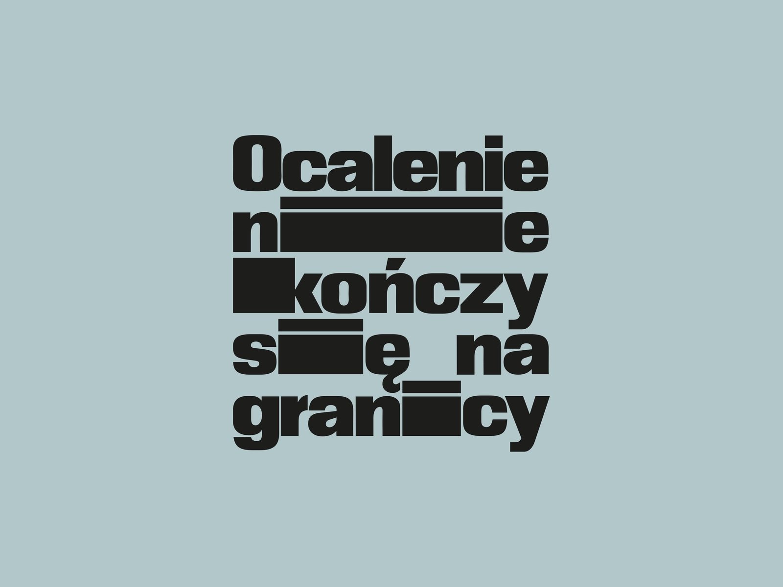
For example, we worked with Fundacja Ocalenie to do a pro-refugee campaign to change the image of the migrant.
KZ: You’re talking about what’s happening at the Polish-Belarusian border, right?
KR: Exactly. There has been a new migrant route established through the Białowieża Forest and we can’t be just silent. We need to get involved. And it was super interesting and important for us, but also very important, very interesting to observe the dynamic of how politics work. You know, since PiS (the right-wing party Prawo i Sprawiedliwość, or in English, Law and Justice) came into power in Poland, they managed to actually shift public opinion from more or less 80% of people supporting migrants. You know, we’ve got this very good example here of Jesus being a Palestinian, and being a migrant himself. One of the fundaments of this faith is to be hospitable. And we, Polish citizens, claim to be very hospitable. It’s a part of our identity, actually. During communist times, we were hosting people who were escaping their regimes. There were many stories of migrants who were being really supported, and being met with acceptance.
KZ: So how does this kind of collaboration physically manifest?
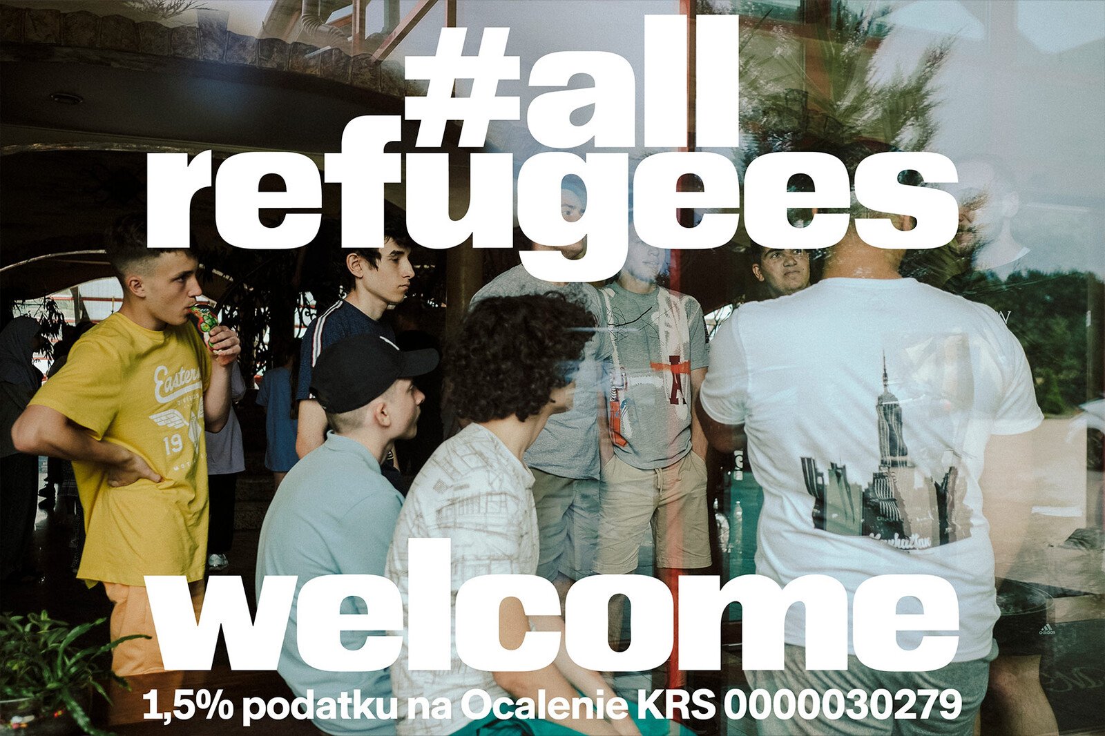
KR: For Ocalenie, we made key visuals and four or five social media campaigns over the years. We were working with the brilliant photographer Alicia Lesiak, and we had different focal points, either to show what’s happening on the border, what are the dialogues that are happening between people on the move and activists, when Ocalenie gets a pin in the forest, what do the migrants need? The essentials, what’s happening? What are the problems these people are facing? We were sharing photos from the forest, from these actions, and telling the story about this support.
The second campaign was actually about the workers at Ocalenie who are of the migrant background or who needed help in the past and they are now a part of the structure, they are helping others. There are people from Iran, from Thailand, people from different countries who were migrants before and now they are helping migrants. It’s amazing. Then we had a campaign focusing on kids, they drew drawings about their experiences, their notions of home, for example. It’s also interesting how you do it, right? Like the tone of the campaign. If it’s too sweet, it kind of doesn’t really serve the purpose because then people say, okay, well, they don’t need anything. They have a flat, they can bake cakes, there’s no problem. And then on the other hand, we don’t want to be too direct with telling a story of suffering and putting people off. What’s the sweet spot, where is the balance? What should we reveal and what should we not? I’m really proud of this collaboration.
KZ: In the beginning of the conversation you were talking a lot about regional specificity, both in the graphics and the aesthetics and the conflicts and the political environment. But you’re also traveling a lot – recently you were in the US, you were living in Berlin for a long time, how do you see Lekko outside of this region when you’re engaging with a broader audience, or one that may be less directly linked to the cues and causes of the region?
KR: So maybe we can talk about Comrade, which was the second typeface we released. It’s very dear to me. I found a beautiful picture looking through the photo archives of MSN. And actually, funny enough, it also comes from Zakopane. There was this bar called Morskie Oko. It had this beautiful lettering which was a mix of straight and italic forms within one word. There is this interesting rhythm, like a woven system. So I designed the typeface from those mixed shapes. Then the russian invasion of Ukraine started. And we decided with Karolina – she is not formally, but she is a part of the studio, definitely she will always be, especially in terms of the strategy and visual language – that we needed to do something. And so the same night we designed materials saying: “in Solidarity with Ukraine”. I just had this new typeface ready and this was the perfect application for it. We just did the lettering over the Ukrainian flag in several different formats, like for print and for web, for posting on social media. And we released the package openly on Google Drive so that everyone could use it. It’s actually still there.
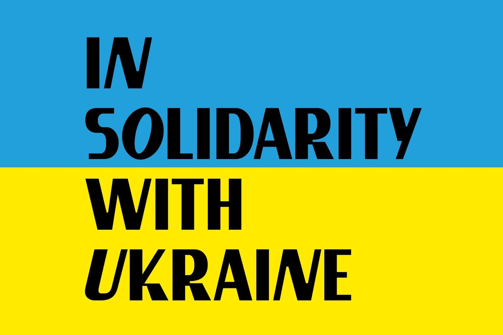
KZ: I still have the graphic on the homepage of the Stroboskop website more than three years later. That war is still going on, man…
KR: Absolutely. We can’t be silent. Every gesture counts. Many people used the graphic, it went viral. People really needed it and still need it. This is an important aspect of our activity; now we have become a team of experts or a go-to studio who creates social media campaigns for institutions and organizations. Both activism and social media work involves this readiness, you know? You don’t have time – now is the moment; you either react or you don’t. But coming back to the solidarity campaign, the Polish Institute in Dusseldorf – apart from using the design in their social media – printed a permanent plaque for their building, and a confederation of institutions dealing with modern and contemporary art, L’internationale, posted our design on their channels. And thanks to them [L’internationale], many of the European art institutions started using the graphic exactly as you say, as a cover picture, as a post, as a statement. It came at the right time. And I think our SL Comrade typeface has reinforced the message thanks to it’s flavor, which as I was saying before, I still can’t articulate.
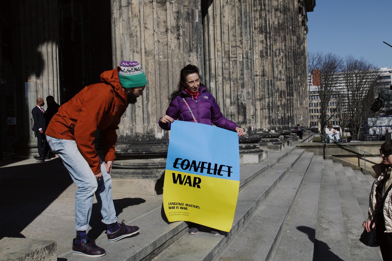
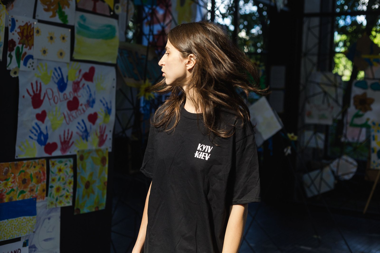
KZ: And there was also the campaign of the T-shirt that used this font, with the two spellings of Kyiv placed one above the other – “KYIV” – the Ukrainian spelling – was written above “KIEV” – the russian spelling – which has a strike through it. This is something that in MOST we have been prioritizing coverage of, the necessity of decolonizing language. And that shirt/that campaign just so succinctly demonstrates that message through one word.
KR: And that’s the whole dynamic of it, right? That was a part of the #correctUA campaign where we used this research that we came across about the spelling of Ukrainian geographical names. We have become accustomed to using Ukrainian geographical names in the russian language. These are the names, the language, of the colonizer. Ukraine has been an independent, sovereign nation for many years, but the Soviet-era versions of many geographic names often persist in international practice. The transliterations of the names of cities, regions, and rivers, from the Cyrillic alphabet into Latin, are often mistakenly based on the russian form of the name, not the Ukrainian. It is extremely interesting for us, how language can be a tool for change, and both graphic design and typographic practices can in a great deal support this process as we are conscious and careful language users and communicators.
KZ: And I think that goes back to the question I asked earlier, about how your work is received outside of this region. If we take this shirt for example, here in Poland, everybody understands what that means. And obviously this is a gross generalization, but the further west you go, the less people understand what this is about. And I think that’s also why it’s so important to keep these posters up and to keep talking about this, wearing the shirts, publishing the texts…because with all of these imperial and colonial aggressions, the farther you go from the epicentres, the weaker the knowledge is and the less empathy and connection. And the nuances are lost. A lot of people think language is just words.
KR: But no, it’s not! That’s where it starts!
KZ: Do you have any experiences, say from the US for example, where the regional specificity of these projects weren’t able to bridge the gap?
KR: It’s interesting because I did some lectures in different art schools in the US, and people were very – even though it’s such a local context and, you know, it’s so far away and exotic for those people – they [the projects] still really spoke to them. People really felt them. In the past, I thought that projects should be as universal as possible to be understood, but now I think the contrary – the more of a local context a project is placed in, the more people will get touched or moved by it. It’s like the project carries more truth and sincerity, so more people will relate to it. Colonialism hasn’t only happened in this part of the globe, and those processes can easily be translated in peoples’ minds. I trust in people being smart.
KZ: But art school is still within the bubble…
KR: That’s true. But in the US, what I’ve found is that people are just so curious, they’re just genuinely interested, you know? We had this funny story because we were staying in New York for almost three months, and we were looking for a sublet. And we found this amazing portal where nice people are advertising their houses for a short period of time. So part of the strategy to get the place was to include a link to my website to show people who we are. And people, I think five out of seven, were like, whoa! What a great website! What amazing things you do, let’s talk about it once we meet, you know? And one of them was this girl called Sahar. And when we came to Sahar’s place, she was like, “let’s do something together, I have a collective.” Her collective is called Grey Area Collective, and she also works at the School of Visual Arts. Now we actually have an idea for a new project together! We have a group now, and we’re kind of pursuing a project that comments more on what’s happening politically in the US, what’s happening on the ground there right now.
KZ: Which is so desperately needed…
KR: Yes, to be outspoken. Which is also very successfully, of course, suppressed. So we’re grateful to be doing this with people who are citizens, because our situation is very fragile. We have to be under the radar at the moment.
KZ: Maybe a final question, just to wrap things up: who is Studio Lekko?
KR: I’m so happy that you asked this. You know, it’s finally going out of my hands, I would say maybe within the last half a year, maybe a little bit more, I’m working with more and more people. It’s now 10 to 12 people kind of constantly, or at least on a more regular basis. Obviously we work with programmers if there is a web design project. We work with motion designers if we need to animate stuff, so we have different kinds of specialists. But you want to know what’s really amazing? It makes me the happiest: we did this open call for a graphic designer at the end of the last year, and it was, I’m not kidding you, there were 2000 applications from all over the world. From the smallest island in the Filipino archipelago to Brazil, Egypt, Bahrain, Poland and Germany, Switzerland. It was Karolina that took the responsibility to categorize them into different categories like typographers, communication designers, motion designers etc. We even had to buy like triple the amount of servers just to store all of this information! So now we’ve got this amazing database of people from all over the world to reach out to!
So one of my highest priorities now is to update our site to mention all the people who are working with us, even if just for me to see. It’s a very interesting process where you’re trusting people and you can’t do everything. There is this point in your career where you’re like, yeah, I need people to collaborate with on a daily basis, and to trust and give them my best projects and autonomy. It is a very psychologically forming experience to give away, to let go. And it can be blissful – but not always though [laughing]!
KZ: I completely understand, I feel that way about a lot of my projects that have grown bigger than my own hands!
KR: It’s crazy, right? And I approach it this way because each person will approach the brief differently, in different ways. And sometimes it’s such an amazing surprise, like I would have never thought of doing it this way! And that for me is totally amazing, to be able to be connected with people like this.
KZ: Kuba, thanks again so much for your time!
KR: Thanks, Katie!